
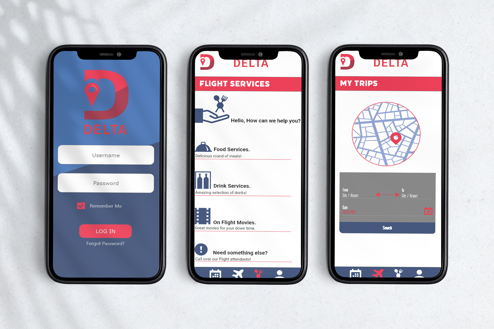
When tasked with redesigning a brand I conducted research on the Delta Airlines company, going over their mobile app I figured it was very plain and not engaging to look at my main focus went into making a better User experience with additional features that was added into the app while on a flight.
My starting design idea was first finding a way to make something that fit more towards the word “Delta.” So my final decision was to use the letter “D” with a location icon to help give the feel of a traveling type of app. Next was to add the additional features that could be used while on a flight such as calling for various services. another page left would show the exact airport your flight is headed towards with the proper date.